LAST UPDATED - JUN 12, 2026 JKHO
Quickly inform users of urgent issues affecting care or operations. Use alerts only for critical, time-sensitive updates.
Overview
An alert is a temporary notification designed to quickly inform users of critical, time-sensitive information and prompt actionable responses. Alerts are used for urgent updates affecting patient care, operational changes, or public health communications.
Alerts can be dismissible or non-dismissible. In either case, since Alerts are temporary, they should be removed once the information is no longer relevant. Overuse of alerts can cause alert fatigue, diminishing their effectiveness.
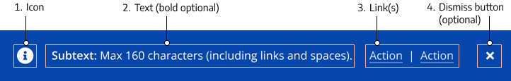
Figure 1.0 – Alert naming diagram
Alert Planning & Submission
Emergency Alert
If an alert must be added to the website immediately due to an emergency, contact the following people:
- Primary – Bruce: text then call 206-303-7477
- Backup – Kayla: text then call 206-495-2243
- After Hours: Call 206-221-1968
Non-Emergency Alerts
For non-emergency alerts, submit a web request at least one week before the go-live date.
Submission Requirements
- Justification and instructions
- Go-live date and removal date (if known)
- Approval from the appropriate content owner
- If another alert exists, justification for the new alert and its prioritization
Note: If the submitter does not provide a removal date for the alert, a separate ticket will need to be submitted to remove the alert.
Alert Types & Usage Guidelines
Alerts should be used selectively and only for critical issues affecting UW Medicine’s services and operations.
Use Alerts For
- Communicating urgent matters impacting patient care and health (e.g., pandemics, extreme weather, disasters)
- Announcing operational changes (e.g., shortages, delays, detours)
- Notifying users of clinic closures, relocations, or openings
Do NOT Use Alerts For
- Non-critical matters that do not impact patient access-to-care
- General health information
- Marketing, press, or promotional material
If the information is relevant but not urgent, consider using a banner instead. Read more about banners.
Alert Scope Levels & Requirements
The Crisis Communications Team determines the appropriate alert type based on the severity and scope of the issue. There are three alert scope levels:
- Global Alert (display across the uwmedicine.org site)
- Scope: Site-wide, high-priority messaging
- Approval Required: AVP Digital Strategy and Operations (or higher)
- Examples: Global pandemics, major weather disruptions, website outages
- User Interaction: Dismissible
- Specific Page Alert
- Scope: Alerts targeted at specific page/s
- Approval Required: Page content owner
- Examples: Clinic hour changes, billing updates
- User Interaction: Dismissible
- Location-Specific Page Alert
- Scope: Embedded alerts specific to clinic or facility pages
- Approval Required: Clinic leader or Page content owner
- Examples: Localized operational updates
- User Interaction: Non-dismissible
Design & Digital Styling
Alert Specifications
Blue Alerts:
Grey Alerts:
White Alerts:
Color & Contrast
All alert text must meet a contrast ratio of at least 4.5:1 against the background for normal text.
Icons must meet at least 3:1 contrast relative to adjacent UI backgrounds.
Links in the alert should meet the 3:1 color contrast threshold, distinguishing links from surrounding text to meet SC 1.4.1 Use of Color (Level A) and should include a non-color visual cue such as an underline.
| Alert Style | Background Color | Text Color | Link Color (Default State) |
| Blue Alerts | #0746AB | #FFFFFF | #DBEBFF |
| Grey Alerts | #F5F5F5 | #333D47 | #004ABE |
| White Alerts | #FFFFFF | #333D47 | #004ABE |
Avoid low-contrast combinations (e.g., light text on light backgrounds). Always verify contrast with automated tools during QA.
For in-depth information, visit the Digital Accessibility Checklist for Color Contrast.
Character Counts & Formatting
Character Limit
- 160 characters (including spaces) – No exceptions
- Links count toward the character limit
Text Formatting
- Bolded text can be used as a headline
- All alert text must meet a contrast ratio of at least 4.5:1 against the background for normal text.
Link Formatting
- Up to two links allowed, separated by a vertical bar (|) symbol
- Links in the alert should meet the 3:1 color contrast threshold, distinguishing links from surrounding text to meet SC 1.4.1 Use of Color (Level A) and should include a non-color visual cue such as an underline.
Placement Rules
- Only one blue alert and one white alert allowed per page
- Do not use two blue or two white alerts on the same page
Emergency / safety site-wide alerts should be placed at the very top of the page, above the header (logo and navigation). This ensures that critical messages are the first thing users see.
Examples:
- Site-wide patient portal outage
- Widespread severe weather causing significant service disruptions
- Major emergency operations impacting patient access to care across multiple regions
- Vaccine recall requiring action from affected patients
- Data breach involving protected health information (PHI)
Operational site-wide alerts should be placed below the header (logo and navigation) and above the main page content. These alerts communicate important operational updates that affect a broad audience but do not present an immediate safety or security risk.
Examples:
- Scheduled website or patient portal maintenance
- Changes to appointment scheduling processes
- Organization-wide service updates
- Updated visitor policies affecting multiple facilities or regions
Specific-page alerts should be placed below the header (logo and navigation), but still above the main page content. These alerts apply only to designated pages or functional sections of the website and must not be displayed site-wide.
Examples include (but not limited to):
- Appointment scheduling pages (e.g., temporary inability to book, modify, or view availability for select services or specialties)
- Billing & insurance pages (e.g., delays or inaccuracies in coverage estimates, payment tools, or insurance verification systems)
- Patient portal login pages (e.g., intermittent login issues, authentication delays, or partial service disruption)
| When both a global alert and a specific page alert are present, the global alert should appear above the specific-page alert. |
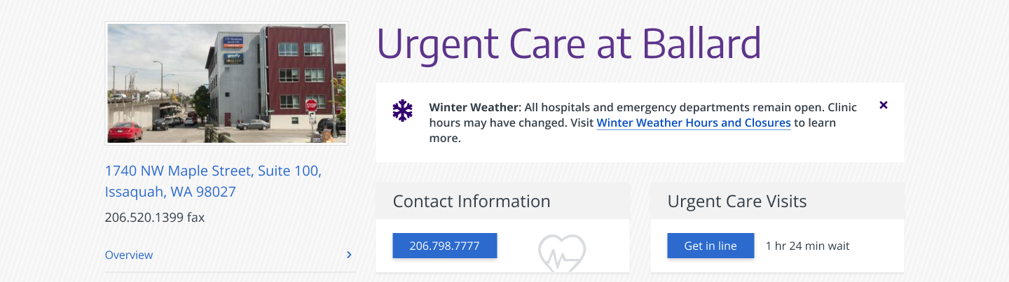
Location-specific page alerts should be placed on the relevant location page directly below the page title, and above the primary content or affected section.
Examples:
- Temporary hours changes at a specific location (e.g. holiday hours, late opening, early closure)
- Service availability changes at that location (e.g. no walk-ins, limited lab services, temporary service suspension)
- Facility or access disruptions at that location (e.g. parking, elevator, entrance changes, minor building issues)
- Location closure, relocation, or major site transition (e.g. clinic moving, long-term closure, major renovation impacts)
Interaction
- Dismissible for global and site-wide alerts
- Non-dismissible for page-specific alerts
Icons
- Icons are optional and should be placed to the left of the alert text and aligned with the dismiss button.
- Icons must meet at least 3:1 contrast relative to adjacent UI backgrounds.
- All icons must be scaled to 28×28 pixels maximum.
- Find pre-approved icons.

Icon Name: Warning sign
Good For: Infection control requirements, Restricted visitor access due to outbreak, Safety alerts, Critical scheduling or treatment impacts
User Impact: Potential inconvenience or access issue, potential patient safety risk or urgent action needed.

Icon Name: Information symbol
Good For: Visitor policy updates Changes to hours, Non-critical status updates
User Impact: Little to no risk to user.

Icon Name: Snowflake
Good For: Winter weather advisories, snow or ice conditions, cold-weather operational impacts, seasonal preparedness messaging
User Impact: Travel delays or appointment disruptions.
Examples
Location-Specific Page Alert
Global Alert

Support
For alert content, user experience, or layout design support, contact the Digital Experience team.
For technical questions about alert behavior, submit a Zendesk request to the Web Operations team.
For initiating emergency alert updates, contact the Communications Team Lead, Elizabeth Sharpe, at esharpe@uw.edu.
For the latest Figma design files for alerts, refer to the UW Medicine Component Library.