

Simplifying and strengthening the brand
Remote treatment is a flexible method for showing an approved clinic, department, division, office, program, service line, or shared service name alongside the UW Medicine logo, without altering or combining with the logo. It ensures consistency while allowing you to adapt name placement to your layout’s needs.
This approach helps us:
- Present UW Medicine as a unified health system
- Keep our brand clean and recognizable across all touch points
- Reduce duplicate or competing logos in the market
- Help patients, students, partners and donors navigate our system
- Allow design flexibility
What it is not
- Not a new logo for your area
- Not a lock-up or a permanent, fused logo/name file
- Not restricted to one arrangement — you choose the position that works for your layout
Key guidelines:
- Keep them separate
Always maintain at least the height of the “M” in “Medicine” between the UW Medicine logo and your name, whether placed horizontally or vertically. - Flex your placement
Position the name above, below, beside, or even in a separate part of your layout — as long as spacing and balance feel right. This is designed for flexibility. - Stay consistent in look
Use Encode Sans Narrow Bold, ALL CAPS. Match brand‑approved colors. If the name spans two lines, keep line height at 1.2. - Optional slash
The gold diagonal slash is optional. Use it when it supports your layout or omit it for a more minimal design. A gold horizontal line should never be used. - Sizing balance
Size your name so it’s visually balanced with the UW Medicine logo. The cap height should never exceed the “Washington” word in the logo.
Examples below show horizontal remote treatment (left) and vertical remote treatment (right) using the UW Medicine primary vertical logo.
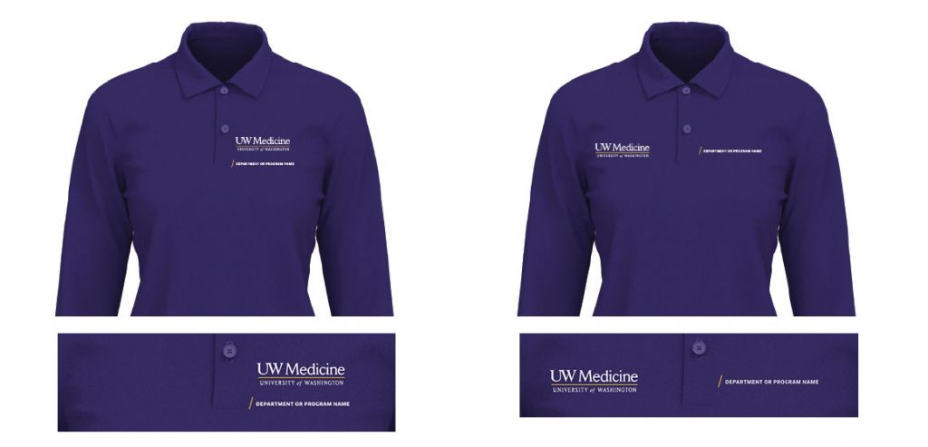
Examples below show vertical remote treatment (left) and horizontal remote treatment (right) using the UW Medicine primary vertical logo with the gold diagonal slash preceding the remote treatment.
Quick Reminder: Name placement does not equal a new logo
It’s a flexible arrangement rule for separate elements, so your layout works for both your area and the UW Medicine brand.
Remote treatment sizing and placement flexibility
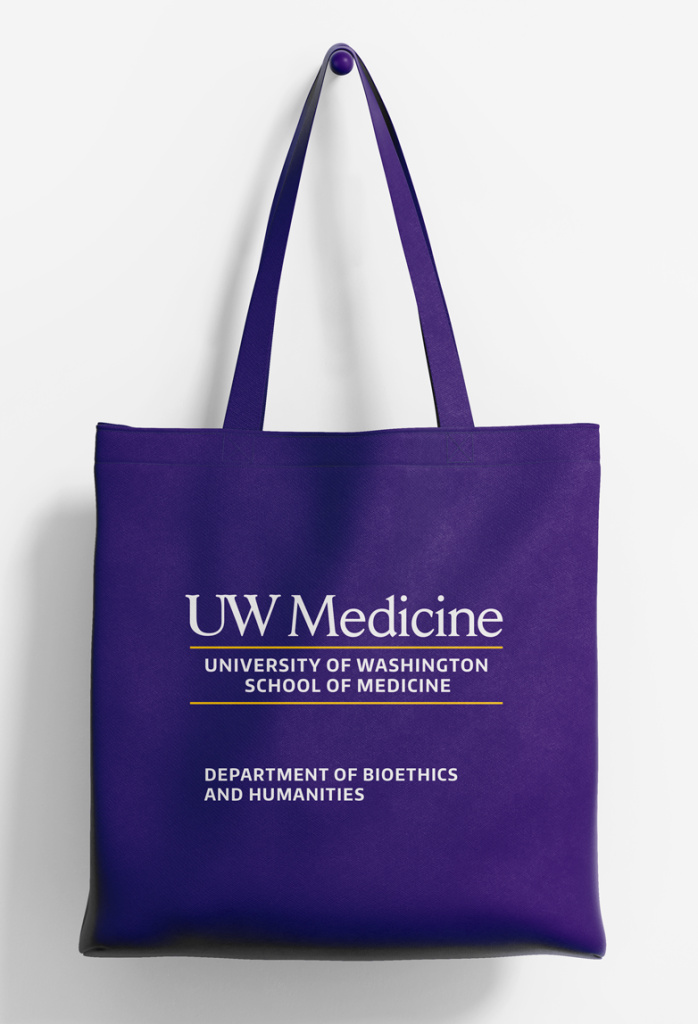
In most cases, the remote treatment can be placed on the opposite side of a layout, aligned horizontally with the primary logo. In restricted spaces like the insulated mug below, the remote treatment should be aligned vertically with the primary logo and appear no closer than the logo “M” clear space. Remote treatments may appear with or without the diagonal gold slash and can be flexibly sized as a headline if preferred.
Service lines and specialties have the option to use remote treatment with the primary logo or the primary logo and tagline, instead of their logo.
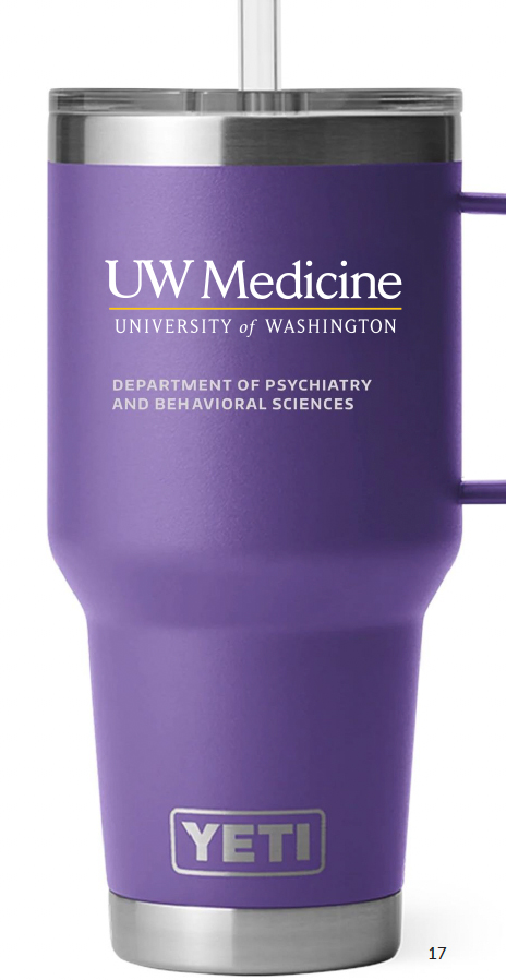
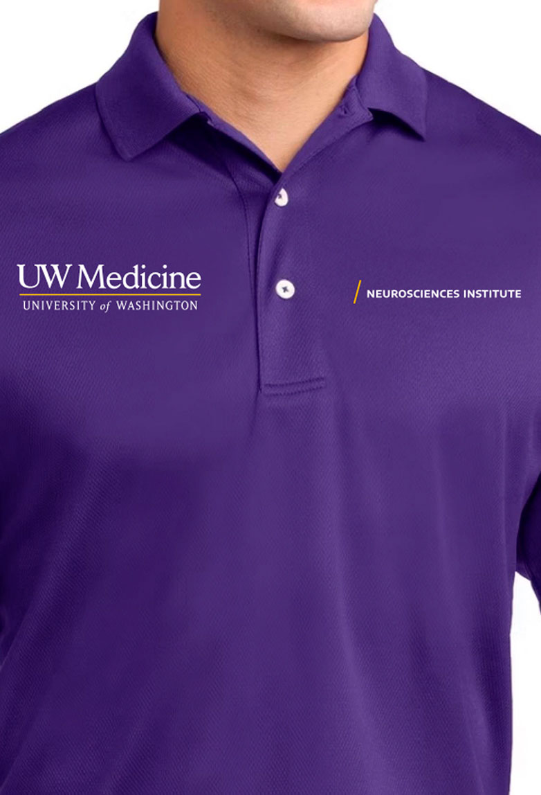
Minimum remote treatment spacing without gold slash

Minimum remote treatment spacing with gold slash

Designing with remote treatment
You can speed your work by using a template or the Remote Treatment Builder tool in Canva.
- Choose your team’s Canva link (UW Medicine Team or School of Medicine Team).
- Add your approved name in the builder.
- Position per the flexibility rules above.
- Export for your print, digital, or product layout.
You may use one of the templates (pictured below) or our remote treatment builder tool in Canva. To access the tool, you must be logged in to the UW Medicine Team or School of Medicine Team accounts on Canva. Please select the correct button link for your team.
Once your remote treatment has been created in Canva, follow these three easy steps to apply it to your design:
- Place the primary UW Medicine logo (or entity logo) on your layout.
- Place the remote treatment horizontally or vertically aligned to the primary UW Medicine logo, allowing for at least one “M” clear space.
- Size the remote treatment proportionately to the primary UW Medicine logo. The height of the text in the remote treatment must not exceed that of the University of Washington wordmark.
Unacceptable usage of remote treatment
The following examples illustrate remote treatment that does not adhere to UW Medicine brand guidelines.
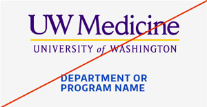
Don’t use unapproved colors for the remote treatment.
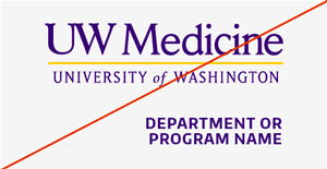
When stacked under the primary logo, don’t right-align the remote treatment. It should be left-aligned or centered.
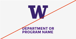
Don’t use with an unapproved primary logo or unapproved name.
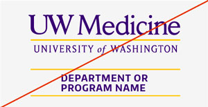
Don’t use the gold horizontal line with the remote treatment.
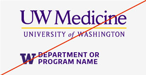
Don’t add unapproved icons or the block W to the remote treatment.
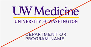
Don’t use an unapproved font.
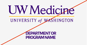
Avoid placing letters too close together. Use the required 75 tracking for letter spacing.
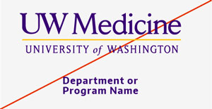
Don’t use lower case or title case.
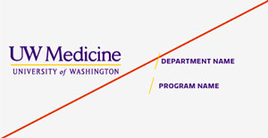
Don’t use two names combined with the primary logo. Choose one for remote treatment.
Applying remote treatment
Remote treatment connects and simplifies navigation across most UW Medicine experiences: Care, Education and Research and Shared Services. See examples below for how remote treatment can be applied.
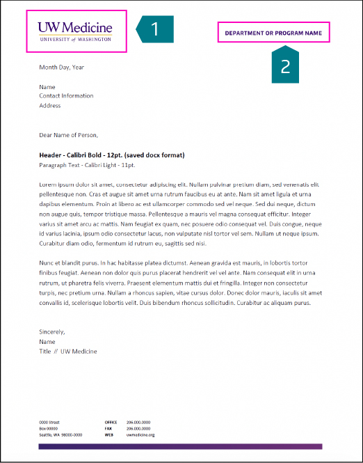
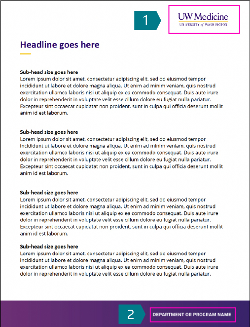
In the examples, the numbers indicate the following:
- UW Medicine primary logo (can be an entity logo or tagline lock-up logo)
- Remote treatment of a service line, speciality service or department
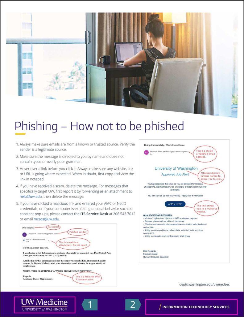
Example of fact sheet showing remote treatment using the gold slash with the
UW Medicine Primary logo (1) and shared services (2).


Example showing an entity logo (1) paired with an academic department where the department name (2) is used as the headline to a tri-fold brochure.
Example showing the primary logo (1) paired with a service line (2).
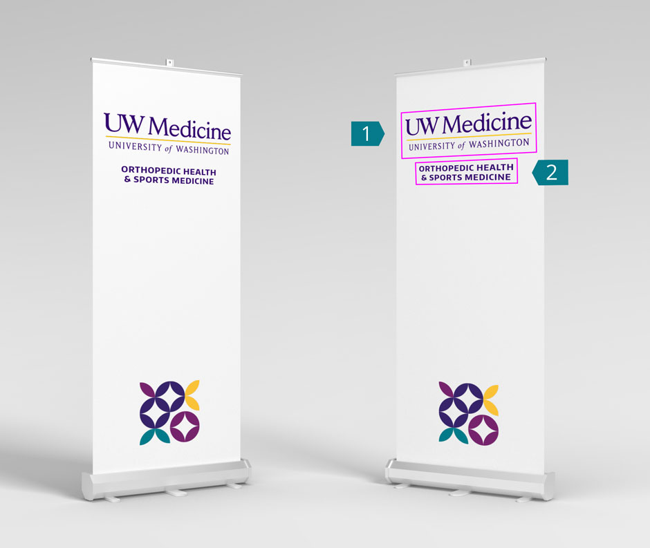
Example of pull-up banner logo placement for events showing the primary logo (1) and a service line (2).
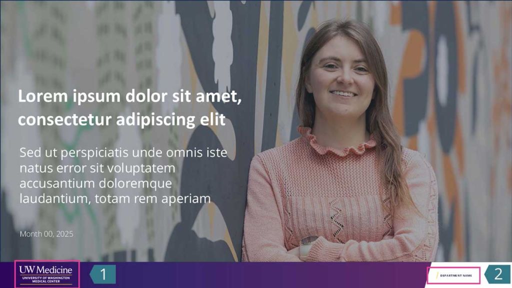
PowerPoint Presentation cover page example showing an entity logo (1) and department name (2).
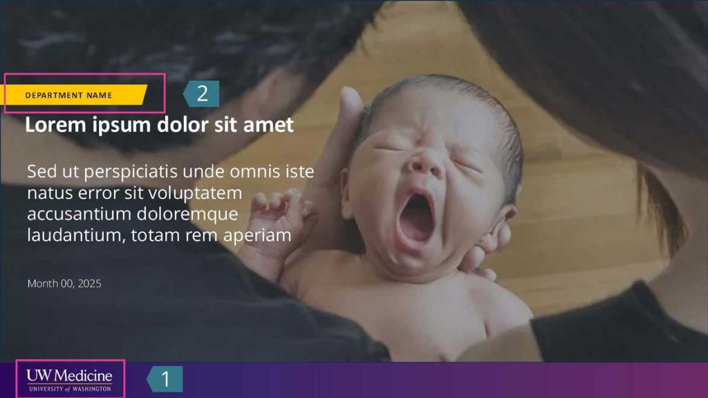
PowerPoint Presentation cover page showing the department name on the gold bar (2) and the primary logo (1).
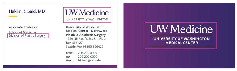
Business card showing the primary logo (1) with the division name (2) and an entity logo on the back of the card.