LAST UPDATED - DEC 16, 2025 HEATHERV
Overview
The Text-Based Hero is designed to help users quickly understand the purpose of a page. It places emphasis on a headline and subtitle contained within a prominent white content block, layered over a full-width background image.
Use this component to introduce a landing or directory page with a message-forward approach that supports wayfinding and clarity within a consistent layout across uwmedicine.org.
Text-Based Hero Elements
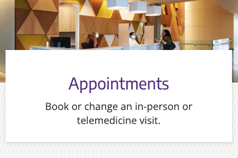
Figure 1.0 – Text-based hero naming diagram
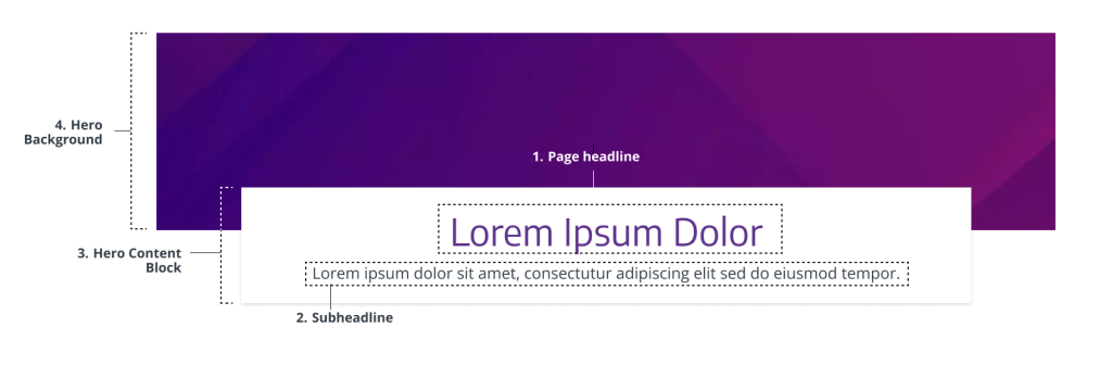
- Page headline – Essential for webpage attention, page purpose, and clarity. Required.
- Subheadline – Provides vital context to support user understanding of the page. Required.
- Hero content block – Container that includes the page headline and subheadline. Required.
- Hero background – Supports the headline message without distracting from it, reinforcing brand personality and visual consistency. Required.
Usage Guidelines
When to Use
- Use when the primary message is text-driven and should take priority over imagery. (e.g., service pages, blog categories, or overview pages)
- Use when fast, accessible communication is needed. (e.g., landing pages or support pages that don’t have strong visual representation)
- Use when visuals are not essential or would distract (e.g, directory pages that list or group related pages, content-heavy pages, or more functional pages)
- Use when you’re leading with a strong message, a simple key action, and don’t have a high quality visual (e.g., marketing campaign or headline-focused conversion page “Your Health, Our Priority.”)
When to Avoid
- Avoid if you have a photo or image that is critical to the visual storytelling and understanding of the page (e.g, homepage, portrait, single-subject photos)
- Avoid if you’re leading with 1-2 main key actions or navigational links on the page and you have a strong compelling visual. Use a Split-screen hero instead.
- Avoid when there is no appropriate background photo available that fits on wide-screens.
- Avoid on pages with no clear heading or supporting text
- Do not use if the content is too brief to warrant a dedicated hero section. Omit the hero instead (e.g., lead capture, download, login, forms, tool page). Visit Heroes to read more about when to omit a hero.
Component Variants
Top-Centered Hero
Purpose: To create a visually striking, message-first introduction with supporting background imagery
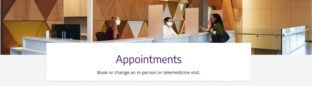
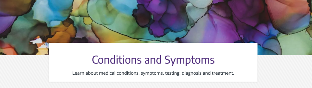
Examples:
- “Appointments” page
- “Conditions and symptoms” page
Styles & Guidelines
Color & Contrast
- Background colors: White, light grey, a diagonal striped pattern of white and light-grey.
- Text colors: Purple (headline), Dark grey (supporting text)
Button & Link Styling
- There are no applicable buttons within a text-based hero.
- The Text-Based hero can be paired with a Large-Button CTA Bar.
Spacing & Layout
Ensure sufficient space:
- Above and below the white block
- Between headline and subtitle
Iconography & Illustration
Icons and illustrations are not used in the Text-Based Hero.
Layout
- Default layout type: Full-width block
- Element alignment: Center-aligned text inside a white overlay block
- Content width behavior: Grid-aligned, max width of 1200px
- Spacing expectations: maintain visual balance in relation to image height and text block
Responsive Behavior
Mobile (≤768px)
- Stack headline and subtitle vertically
- Ensure text remains legible over background image
- White block should maintain padding and central alignment
Tablet (768–1024px)
- Maintain centered block layout
- Adjust padding for comfortable readability

Desktop (≥1024px)
- Full-width background image
- Center-aligned white content block
- Preserve 16:9 image ratio for consistency
Page Placement Guidelines
- Use this component only at the top of a page.
- Do not use multiple instances per page
- Avoid combining with other hero components
Content Guidelines & Character Counts
Page Headline
- Purpose: Deliver the core message or theme of the page
- Formatting & Tone: Headling level H1. Sentence case. Clear, message-first, and aligned with brand tone
- Length: 5–99 characters with spaces (aim for one line on desktop)
- Examples:
- “Manage your appointments in one place”
- “Care options for every condition”
Subheadline
- Purpose: Clarify what users will find or do on this page
- Formatting & Tone: Plain language. Short, helpful, descriptive
- Length: 39–239 characters with spaces (2–5 lines max on desktop)
- Examples:
- “Log in, reschedule, or get help with appointment management.”
- “Explore conditions, treatments, and specialists across our system.”
Image Guidelines & Sizes
The top-centered hero image serves as a contextual visual backdrop to the white content block.
Image size required: 1300×300
Aspect ratio: 13:3
File type compression:
- .JPEG: Under 200 KB
- For photographs where file size reduction is key and slight quality loss is tolerated. Supports all major browsers.
- Set web quality setting of ~60-75% if manually exporting.
- .PNG: Under 150 KB
- For logos, icons, text-heavy images, or images requiring a transparent background or lossless compression. Supports all major browsers.
- Set web quality setting of PNG-8 or PNG-24 if manually exporting.
- Do not exceed 256 MB.
Do:
- Use images that reinforces brand tone but does not convey critical information
- Use wide-angle, ambient, patterned, or landscape imagery.
Don’t:
- Avoid images that distract from or obscure the text.
- Avoid portraits or tightly cropped subjects because the white content block will clip some of the image.
For UW Medicine brand photo styling and approval process, refer to the Photography Style Guide.
Support
If you want support on the best way to organize information on a webpage, improve accessibility and user experience, or need guidance on following the website’s content and style guidelines, contact the Digital Experience team.
If you want a custom illustration, help with photo choices, or want to check that your graphics match the UW Medicine brand, contact the Content & Brand Services team.
If you want to know the technical specifications of a component or want to know how a particular website feature works behind the scenes, visit the Component Library or contact the WebOps team.